

Content Highlight
2017
Total My List Adds
+13%
My List Adds via Highlight Entry
+7%
Detail Page Playback
+4%
THE OPPORTUNITY
After the success of Content Highlight on TV platforms, we learned how valuable showing metadata and video previews are to the discovery experience. We want to roll out a similar feature on web to expand the benefits of this interaction model to our other platforms.
The Challenge
Translate the success of our TV Content Highlight experience into a global web experience. Web supports a drastically different interaction model than TV, using a cursor instead of a fixed selector. This design should explore web-specific interactions that offer a similar experience without compromising the usability of our discovery pages.
My ROLE
Lead Product Designer
Scope & Ownership
UI, User Flows, IxD, Prototypes, Handoff, Competitive Analysis
THE Team
Product Manager, 10+ Engineers/QA
Platforms
Responsive Web
The Problem
Defining pain points
Business problems
User problems
- Users are forced to navigate back and forth between discovery pages and content details pages in order to get the context they need about a show or movie of interest to make a decision about what to watch. This experience can be taxing on the user, leading to cognitive load as indicated by the current bounce rate from web discovery pages.
- The in-market TV experience sets a higher standard fort the discovery experience by surfacing video previews and metadata about each title upon hover while browsing. Users who come to our web platform receive an experience inconsistent with expectations set by our other platforms which discourages users from returning to the platform.
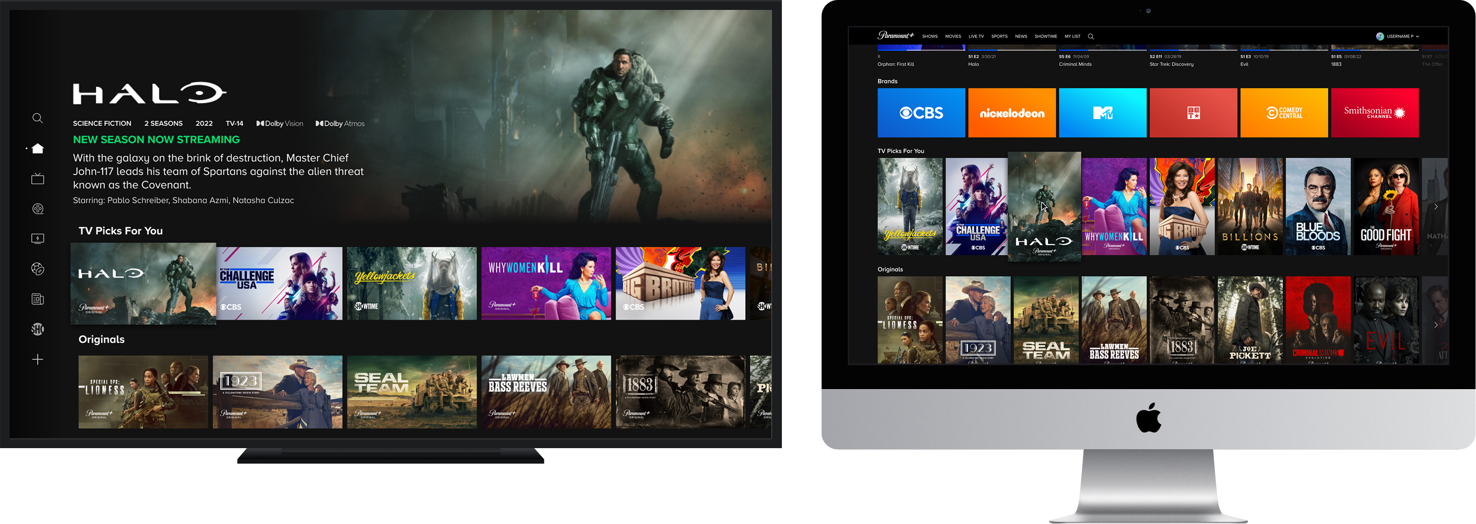
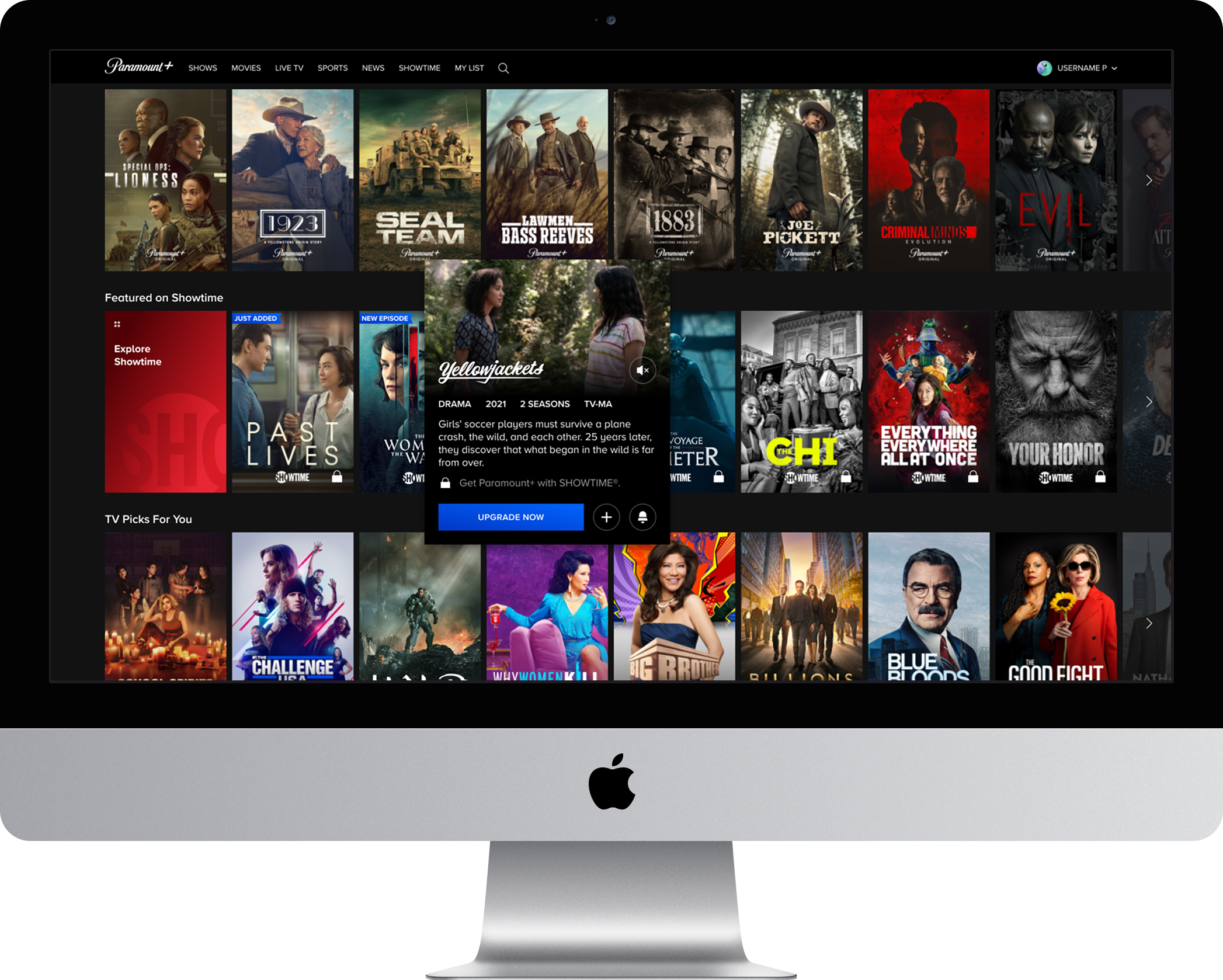
TV: Content Highlight
Web: Hover experience
RESEARCH
Gathering insights
Competitive analysis takeaways
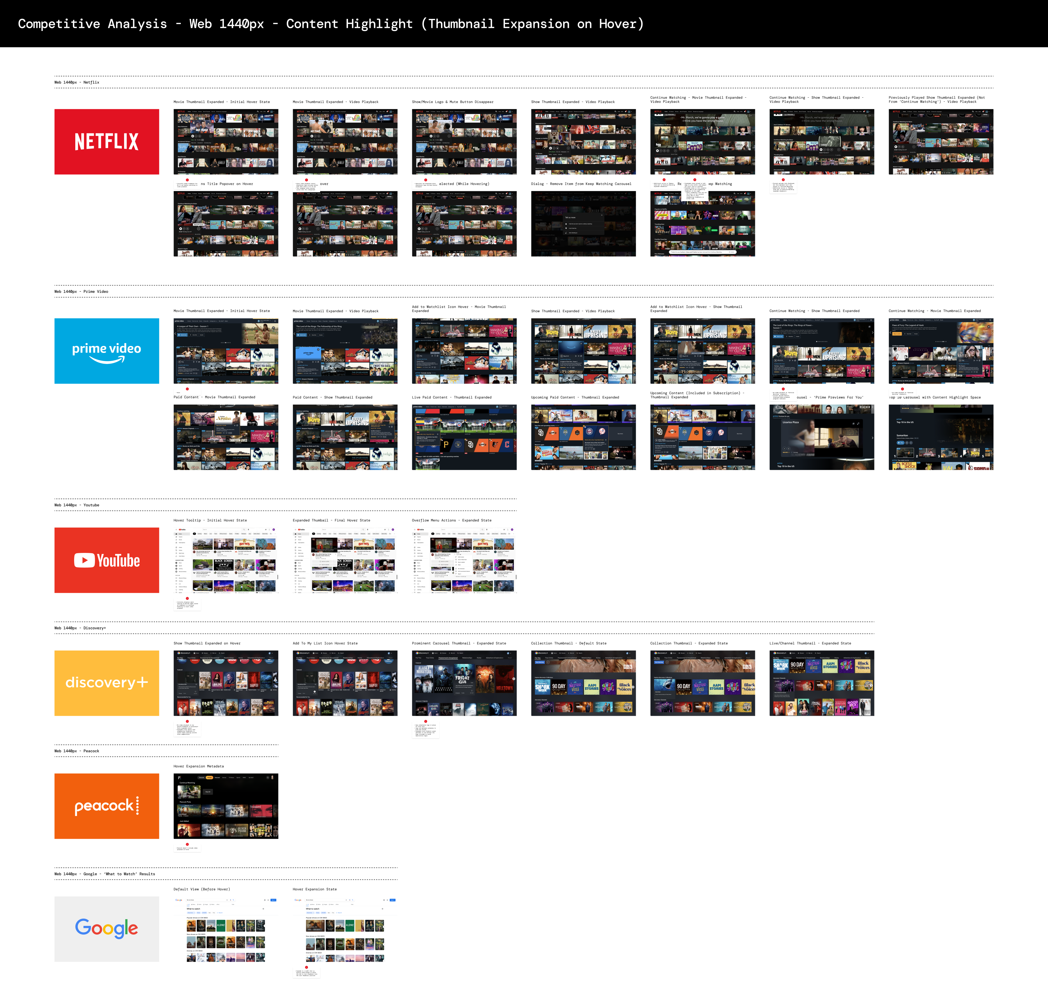
- Common interaction models amongst compeitors including Netflix, YouTube, and Amazon Prime involve displaying an expanded state of content tiles/posters in the discovery experience to display additional info and video. These are all triggered on a hover interaction after a slight delay.
- All examples include common quick actions that you would find on a details page such as direct link to playback, add to My List, and rate.
- Majority of examples opt for an expanded state that simply hovers above the carousel grid without changing the UI behind it. Examples like Discovery+ however, opted to shit the grid over in order to make room for the expanded state. The general consensus from our team was that this can lead to an overly responsive and disorienting experience, considering how easy it is to accidentally trigger this behavior on hover.
EXPLORATIONS
Scoping the solution space
.png)
TECHNICAL Challenges
WHERE WE LANDED
Picking a direction
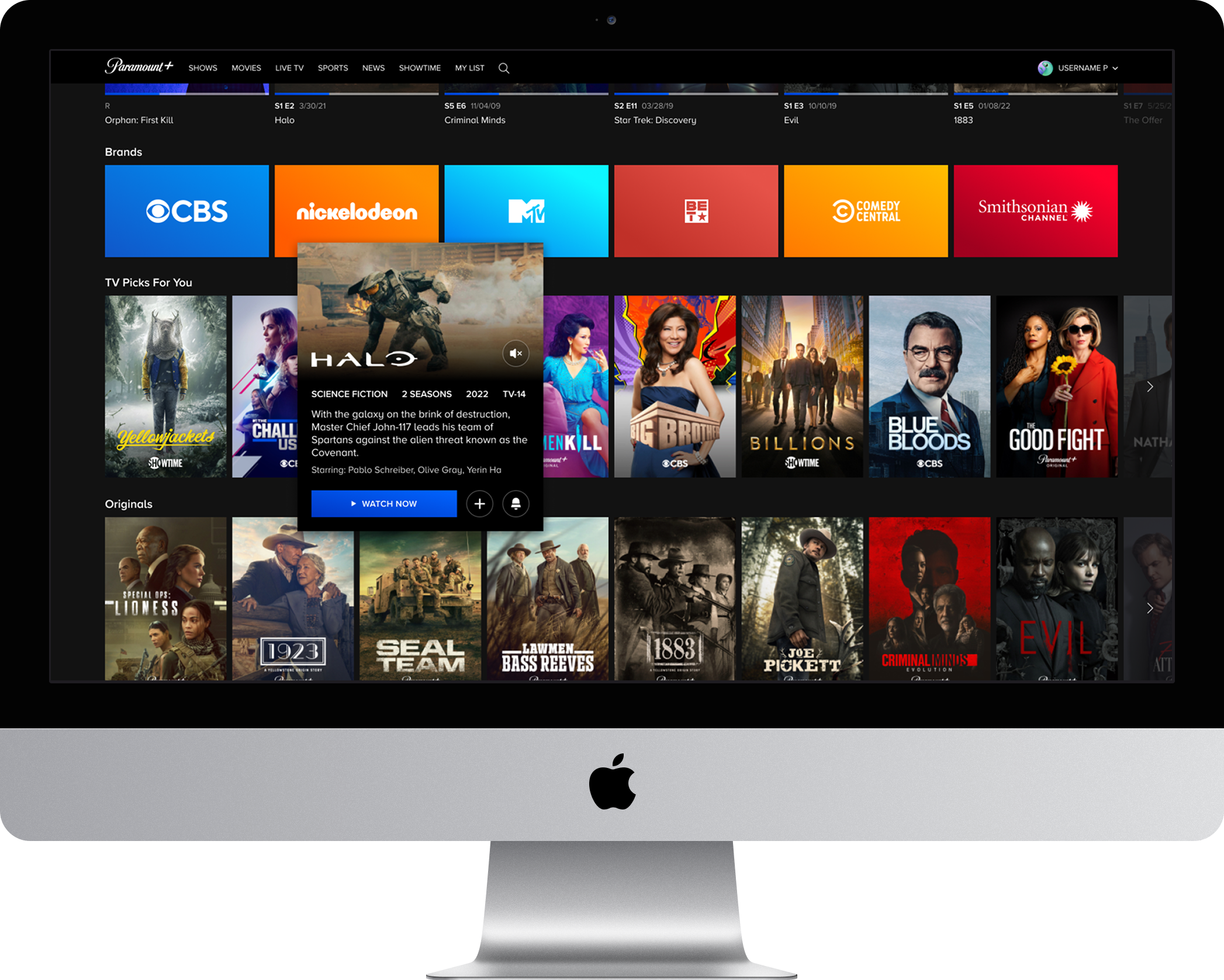
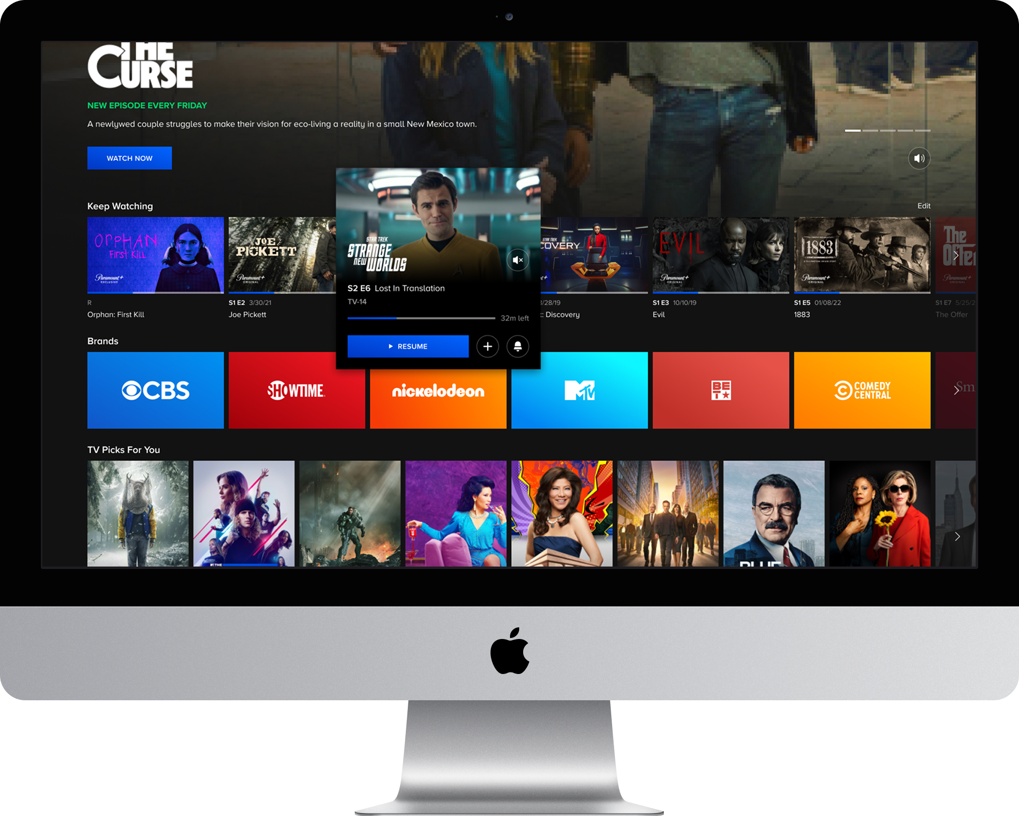
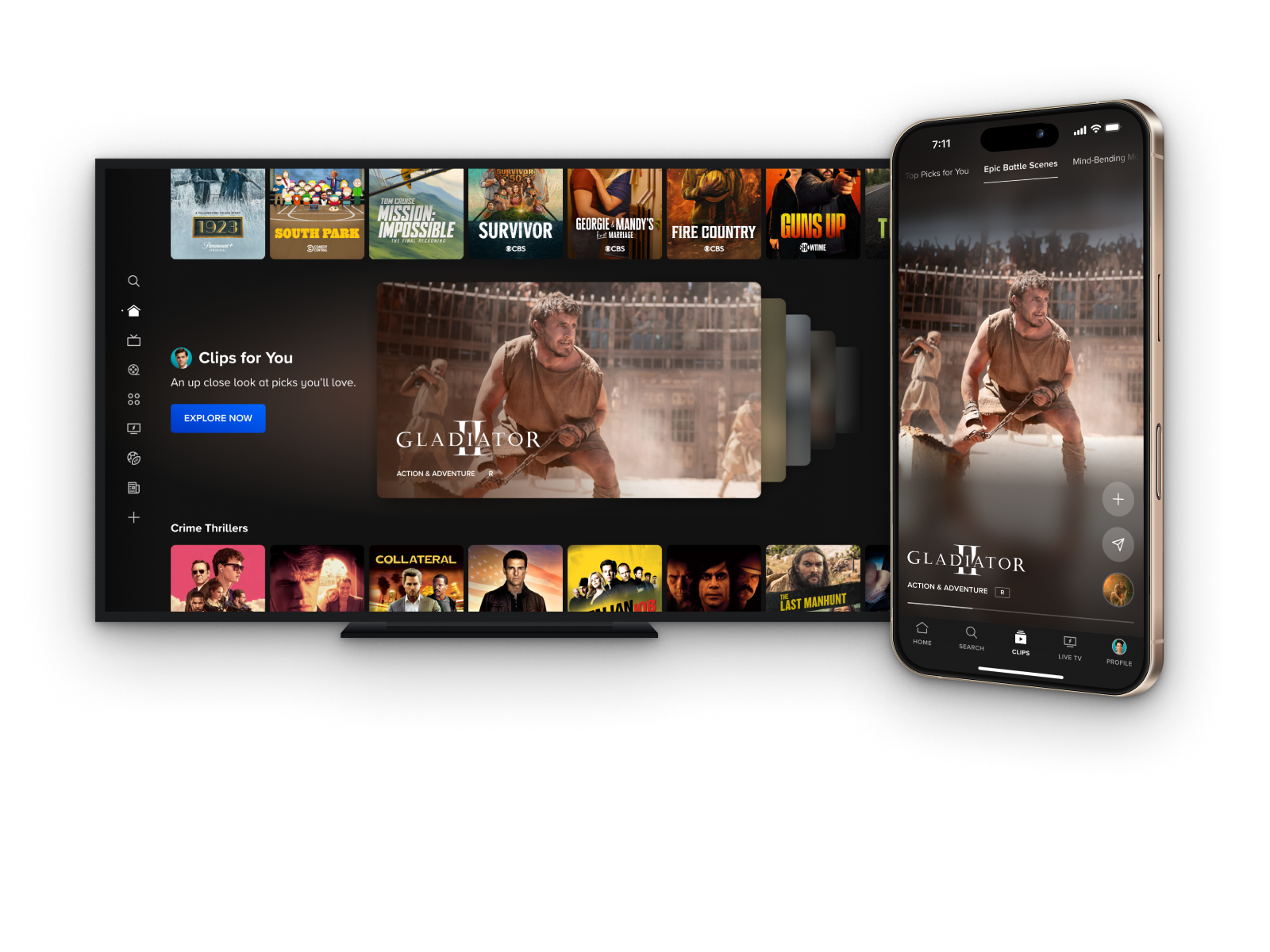
- Identified fragmented secondary button styling as a gap across the experience and established a unified global standard, bringing consistency to every instance across the product.
- Aligned the component's visual language with the gradient-based styling already established in hero units across discovery and details pages, choosing coherence over introducing a new visual pattern.
- Restructured the information hierarchy to match the element stacking conventions used across the broader discovery experience, ensuring the component felt native rather than tacked on.
- Defined a consistent metadata ordering and presentation model across content types that was subsequently adopted as the cross-platform standard, extending the component's impact well beyond its original scope.
- Surfaced cast member metadata within the component to reduce reliance on the details page for a key piece of information users need to decide what to watch, extending its usefulness as a lightweight content evaluation tool.
Prototypes


.png)