

Spotlight Unit
2017
THE OPPORTUNITY
The Challenge
My ROLE
Scope & Ownership
THE Team
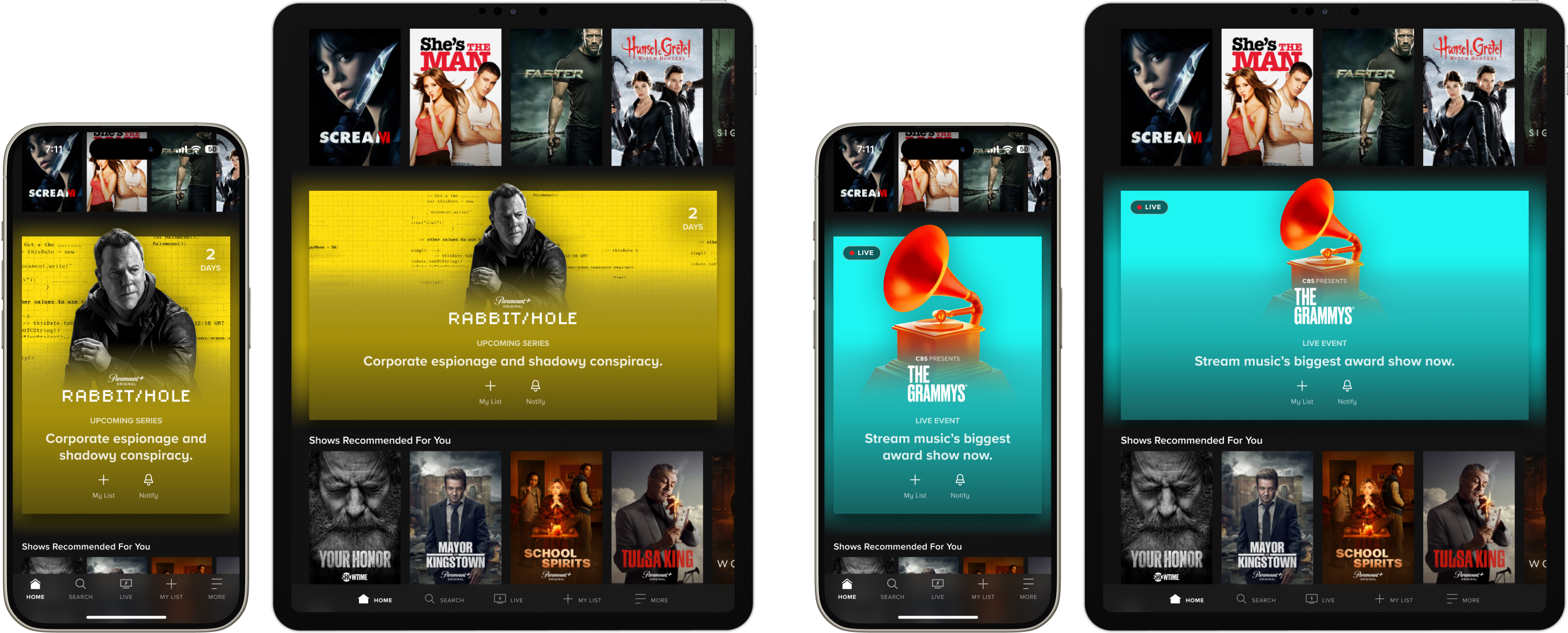
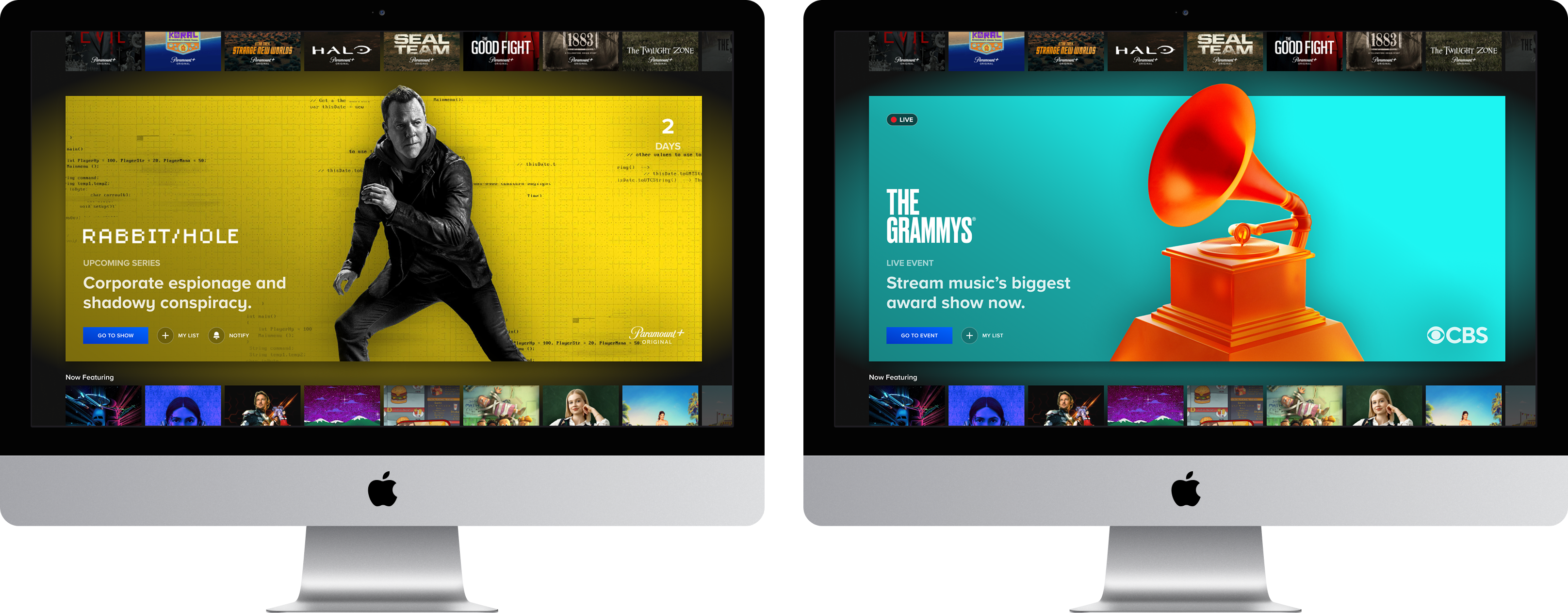
Platforms
The Problem
Defining pain points
Business problems
Problems
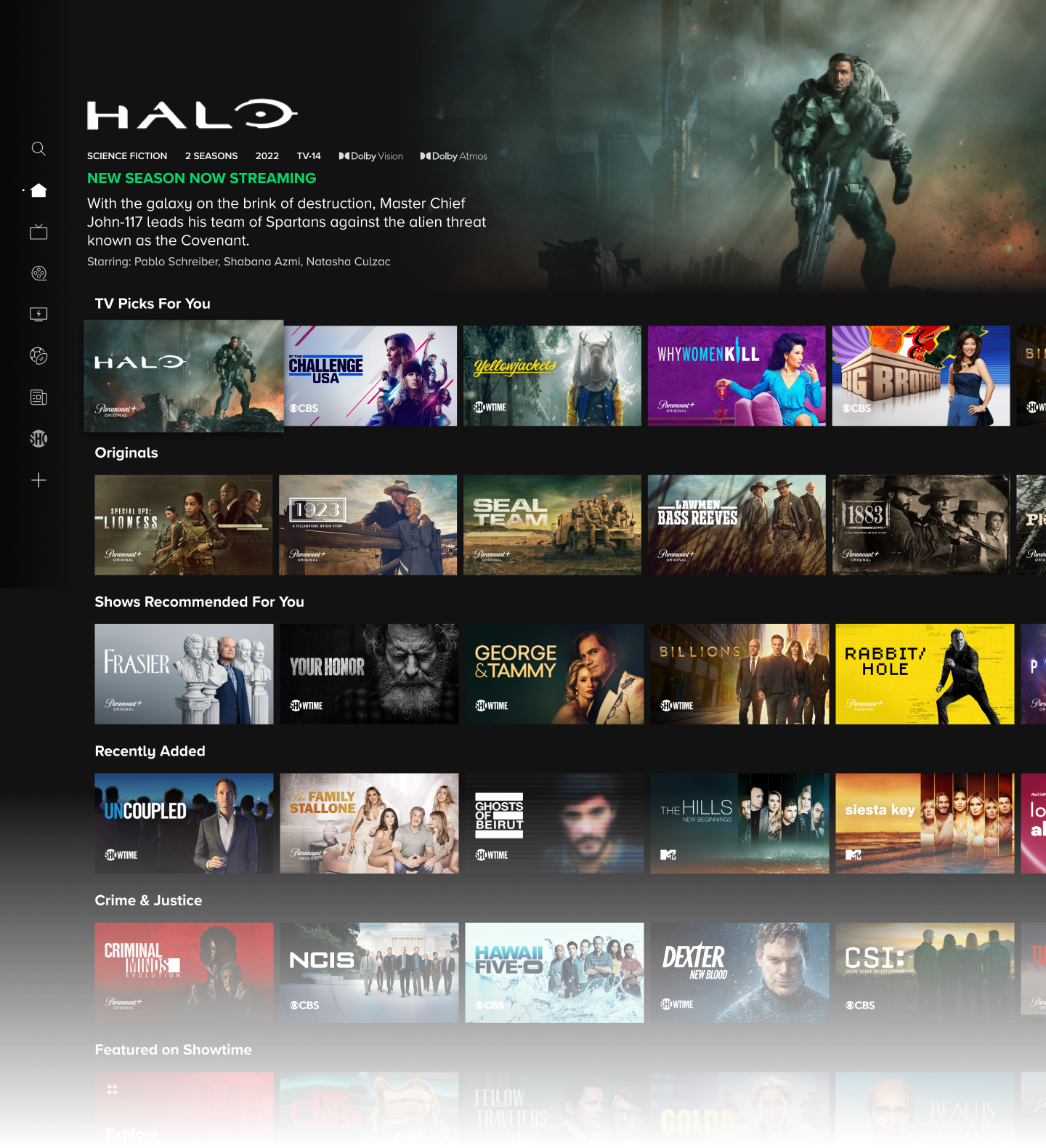
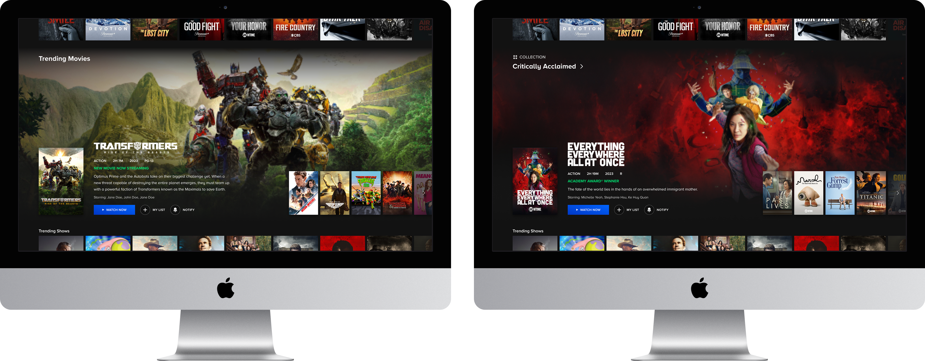
- The primary promotional surface was architecturally constrained to a single position, creating a hard ceiling on how many users could be reached with any given piece of high-value content.
- A single point of failure in the merchandising funnel meant that users who bypassed the marquee exited the promotional reach of the discovery experience entirely, with no recovery mechanism further down the page.
- Despite significant investment in ML-driven personalization for carousel rows, the visual uniformity of those surfaces neutralized its relevance signal, limiting engagement lift to users who happened to engage at the very top of the page.
Goals
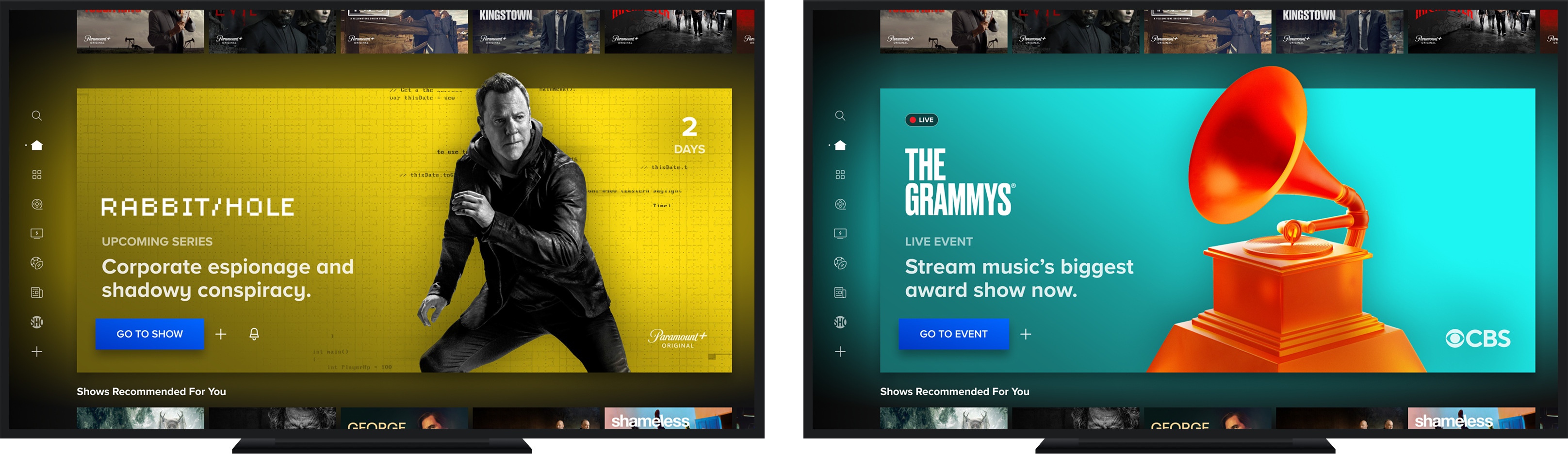
- Product goal: Expand the platform's promotional surface area beyond the marquee to give high-priority content meaningful exposure throughout the scroll trajectory, regardless of whether users engage at the top of the page.
- Business goals:
- Increase unit CTR and video play rates for live events and tentpole releases.
- Drive measurable lifts in Details Page visits, My List additions, and reminder/notification sets as indicators of downstream content awareness.
User problems
RESEARCH
Gathering insights
Competitive analysis
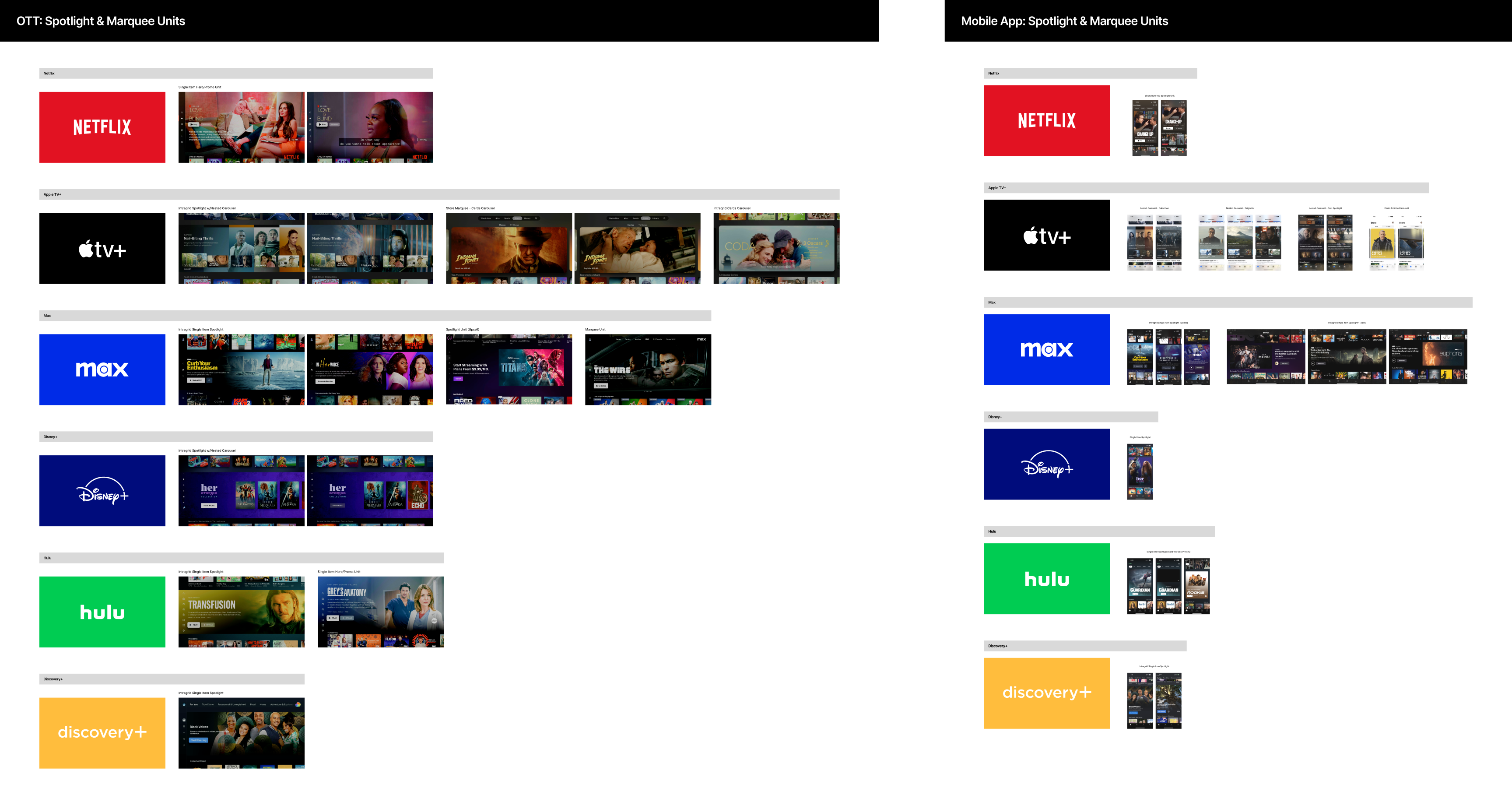
- Best-in-class single-item promo units consistently deprioritized controls and metadata in favor of letting the content and video preview carry the promotional weight, validating the direction toward a more immersive, content-forward layout.
- The most effective competitor examples struck a balance between visual prominence and contextual continuity, dominating attention without fully obscuring neighboring content, reinforcing the case for a unit proportioned to feel like a natural part of the scroll rather than a hard interruption.
- Placement flexibility was a defining characteristic across strong competitor examples, with units performing effectively both at the top of the page and between carousels, directly supporting the strategic premise of a scroll-agnostic promotional surface.
EXPLORATIONS
Scoping the solution space
Iteration 1: Restrained differentiation
- Iteration 1 overview:
- Validated whether the unit could achieve promotional differentiation through scale alone, deliberately anchoring the direction in existing components and artwork-based assets to minimize implementation risk and keep the first concept achievable within current production workflows.
- What didn't work about iteration 1:
- The enlarged poster created immediate asset redundancy, with both a full-bleed background and a prominent foreground poster pulling from the same artwork competing before video preview loaded.
- The poster's dominance also visually overpowered the video preview experience it was meant to frame, undermining the core purpose of the unit.
Iteration 2: Differentiation through new visual patterns
- Iteration 2 overview:
- Explored a high-differentiation direction by defining a new class of production asset with color extraction logic, creating a visually distinct promotional moment that would stand out clearly from the flattened single-image assets used throughout the surrounding carousels.
- What didn't work about iteration 2:
- The solid color extraction treatment represented a significant departure from the artwork-driven visual language foundational to the Paramount+ design system, introducing org-level friction during an active push toward cross-platform discovery unification.
- Introduced a net-new class of production assets requiring custom asset cuts that hadn't been scoped and would have meaningfully increased content operations complexity.
TECHNICAL Challenges
Transitioning in & out of content highlight
Evaluating dev constraints
The Content Highlight transition represented the highest-risk implementation dependency for this project. Each of the 4 platform engineering teams independently spiked solutions, surfacing meaningful variation in what was technically feasible per platform, with some teams facing harder constraints around scroll mechanics and DOM rendering than others.
Working toward a solution
Three transition approaches were prototyped and evaluated in close partnership with all four platform teams, with the goal of landing on a solution consistent enough to feel native across surfaces while accommodating the rendering constraints each platform brought to the table. The final direction prioritized cross-platform achievability and consistency, a deliberate near-term tradeoff on some finer interaction details that were documented for future iteration.
A solution for all platforms
WHERE WE LANDED
Picking a direction
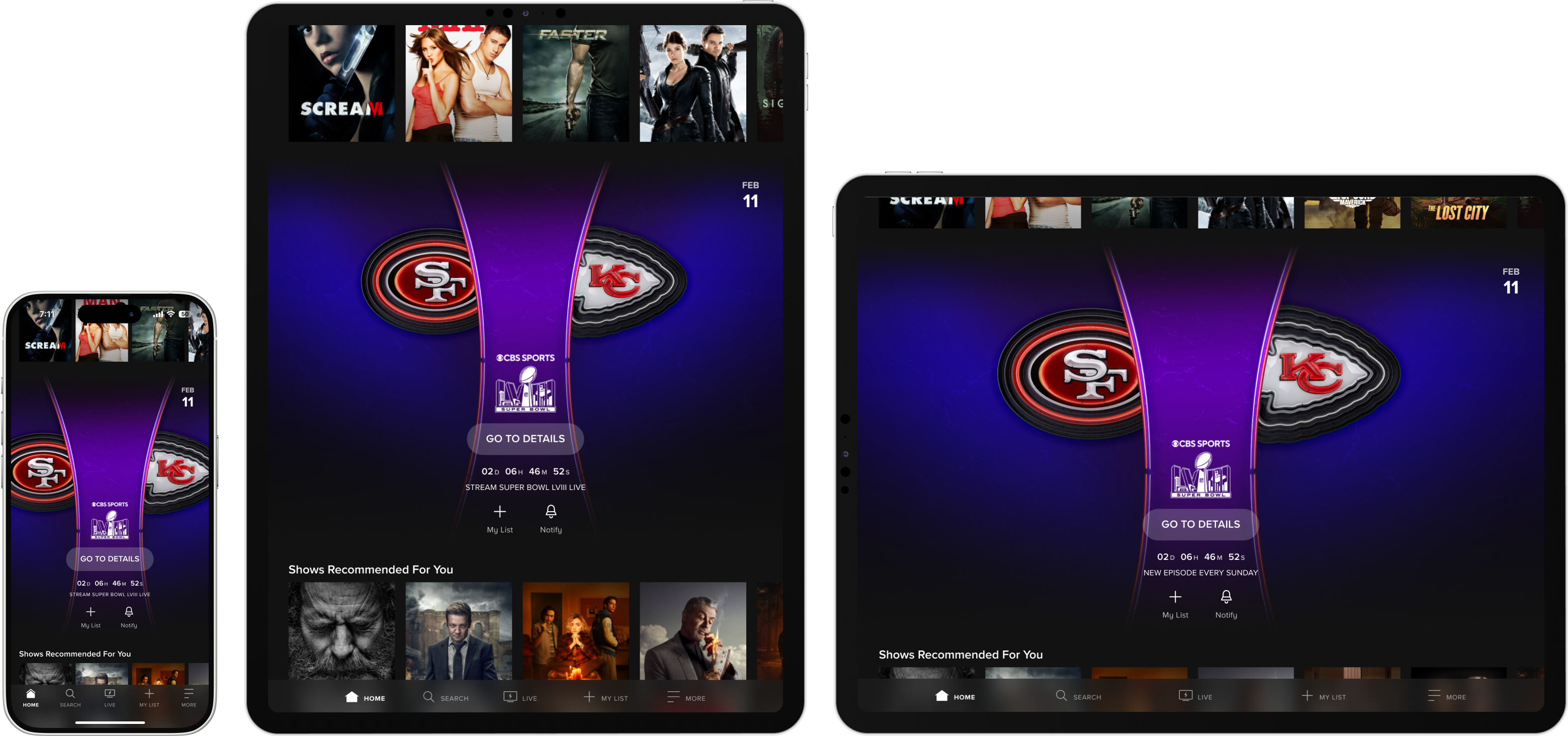
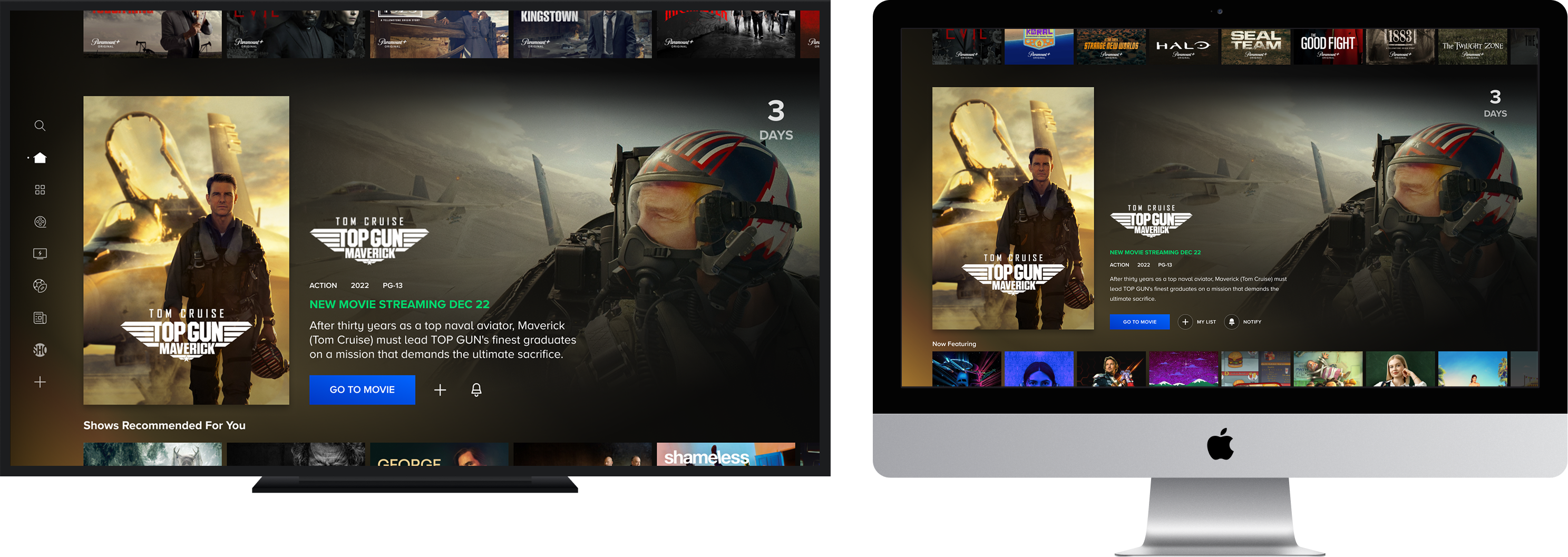
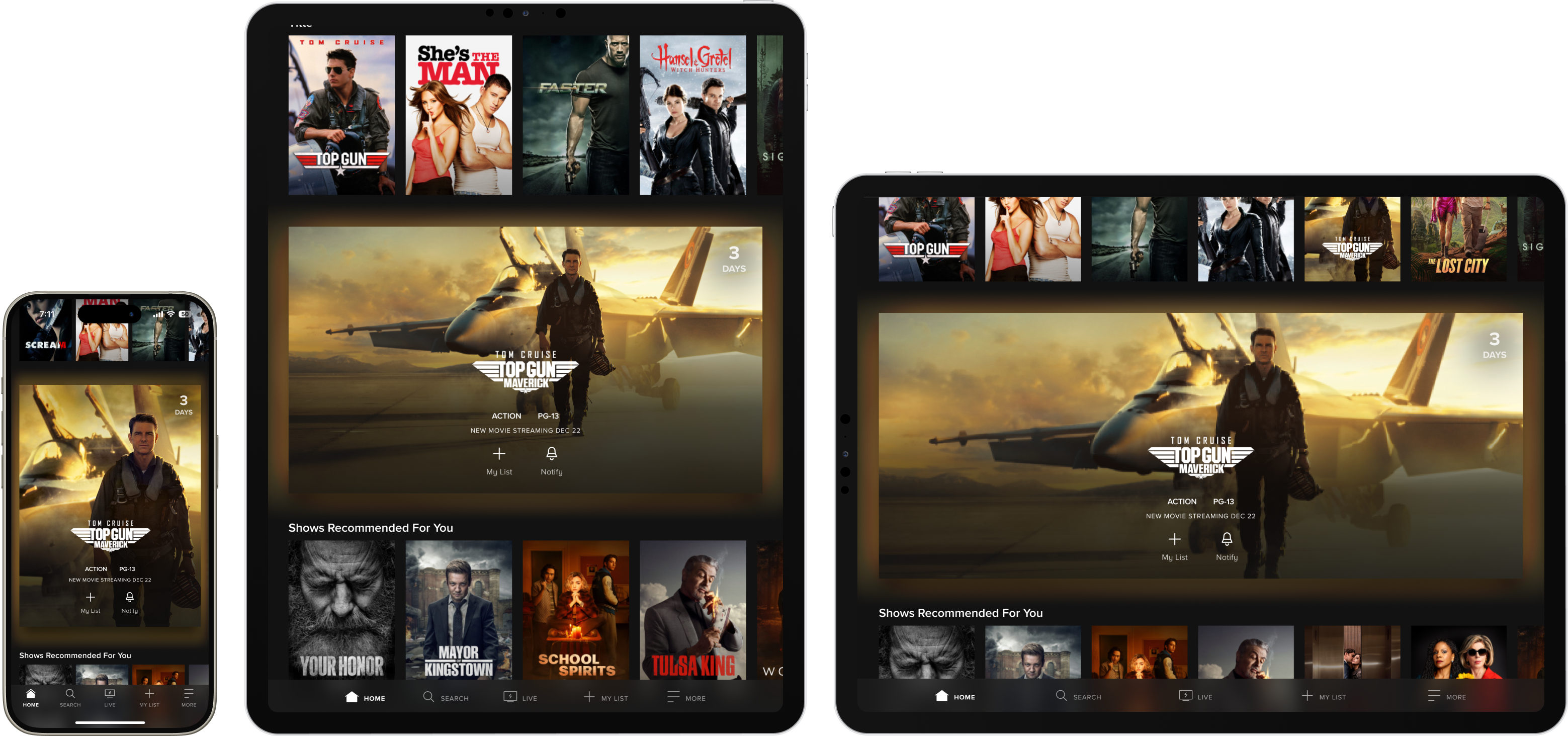
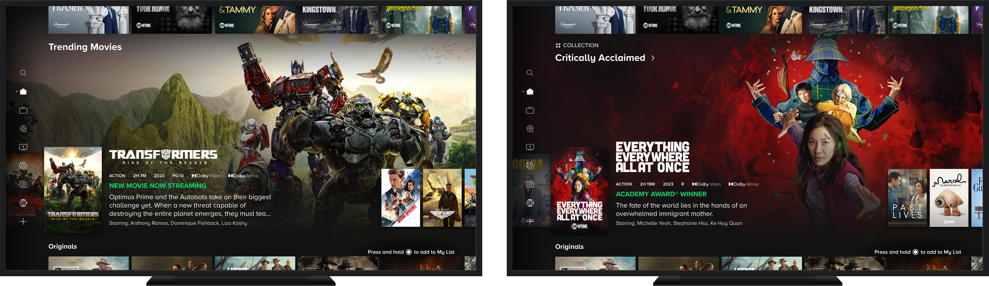
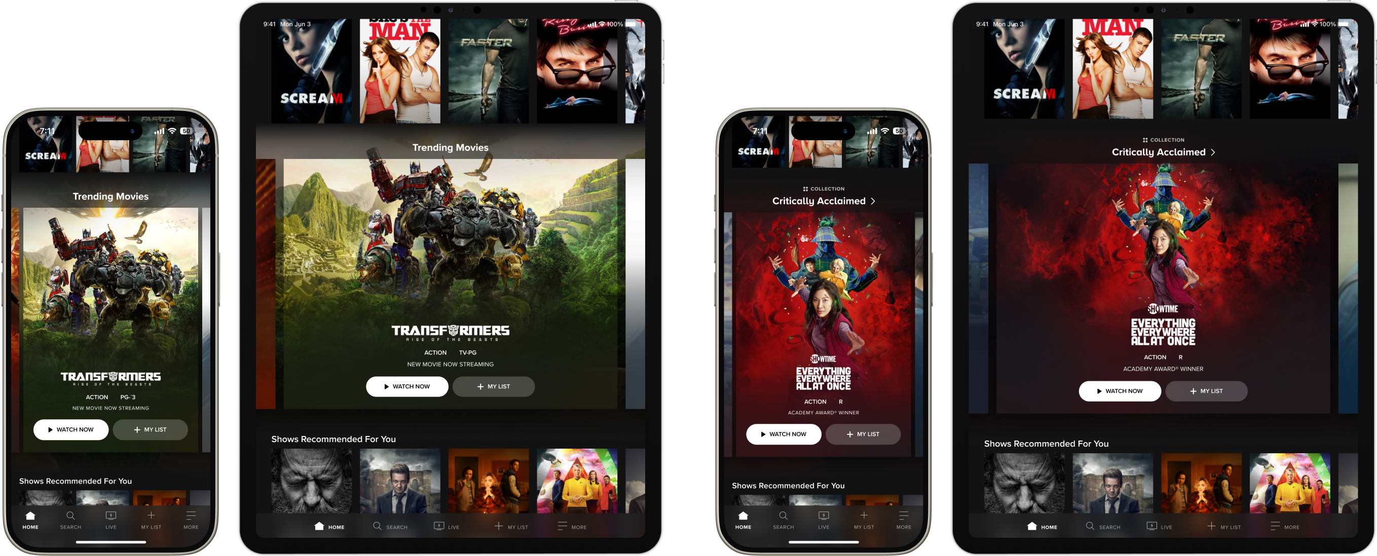
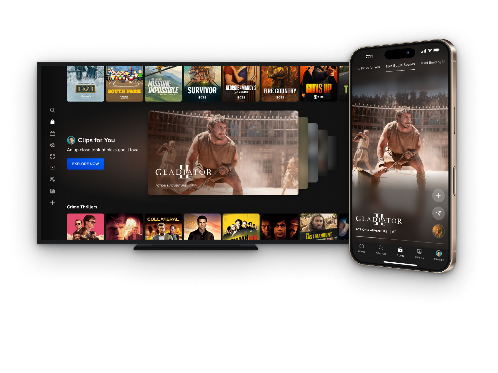
- The final direction balanced system coherence with differentiation, drawing from iteration 1's component fidelity and iteration 2's visual ambition to arrive at a placement-agnostic unit that could scale across any discovery page with minimal custom layout treatment per context.
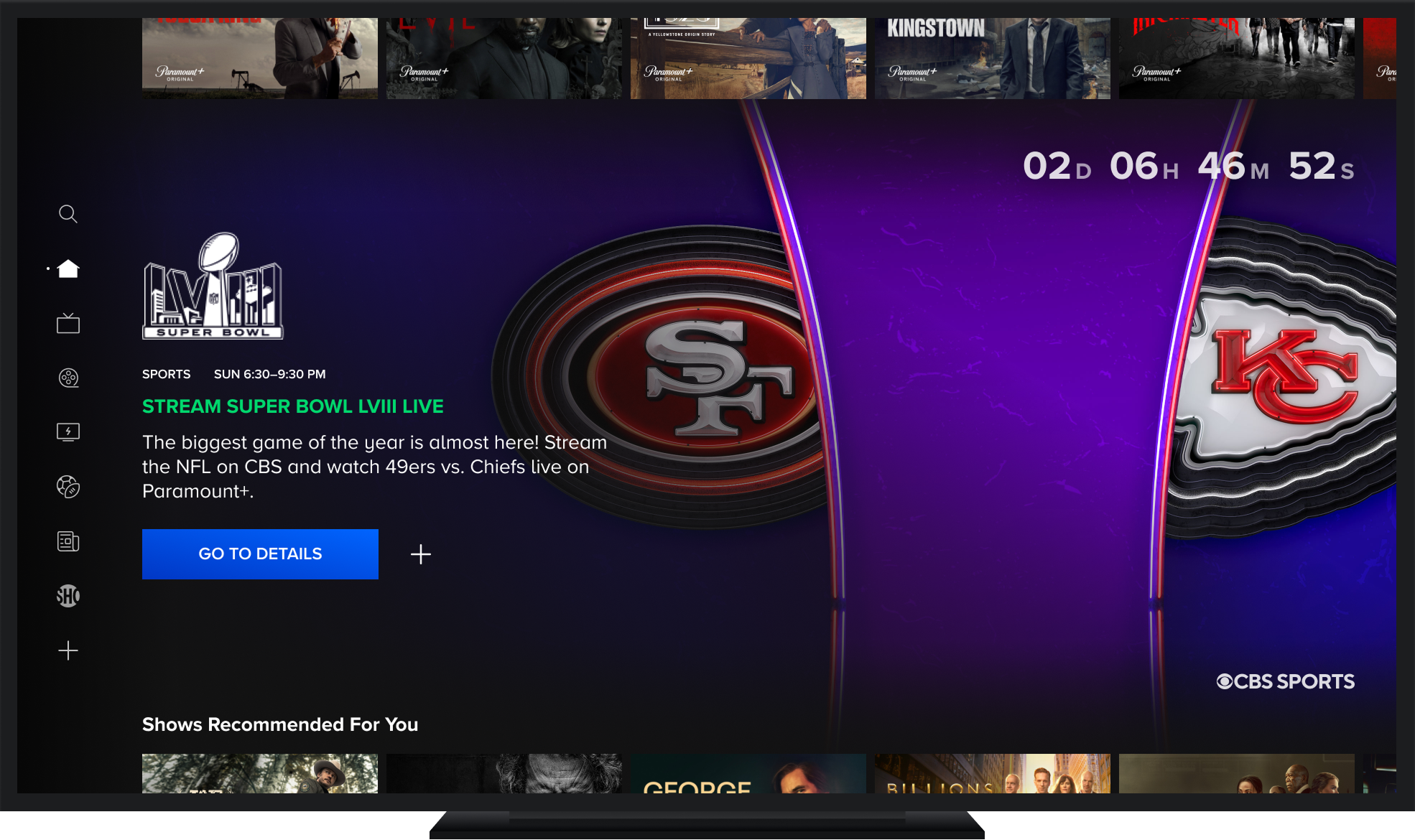
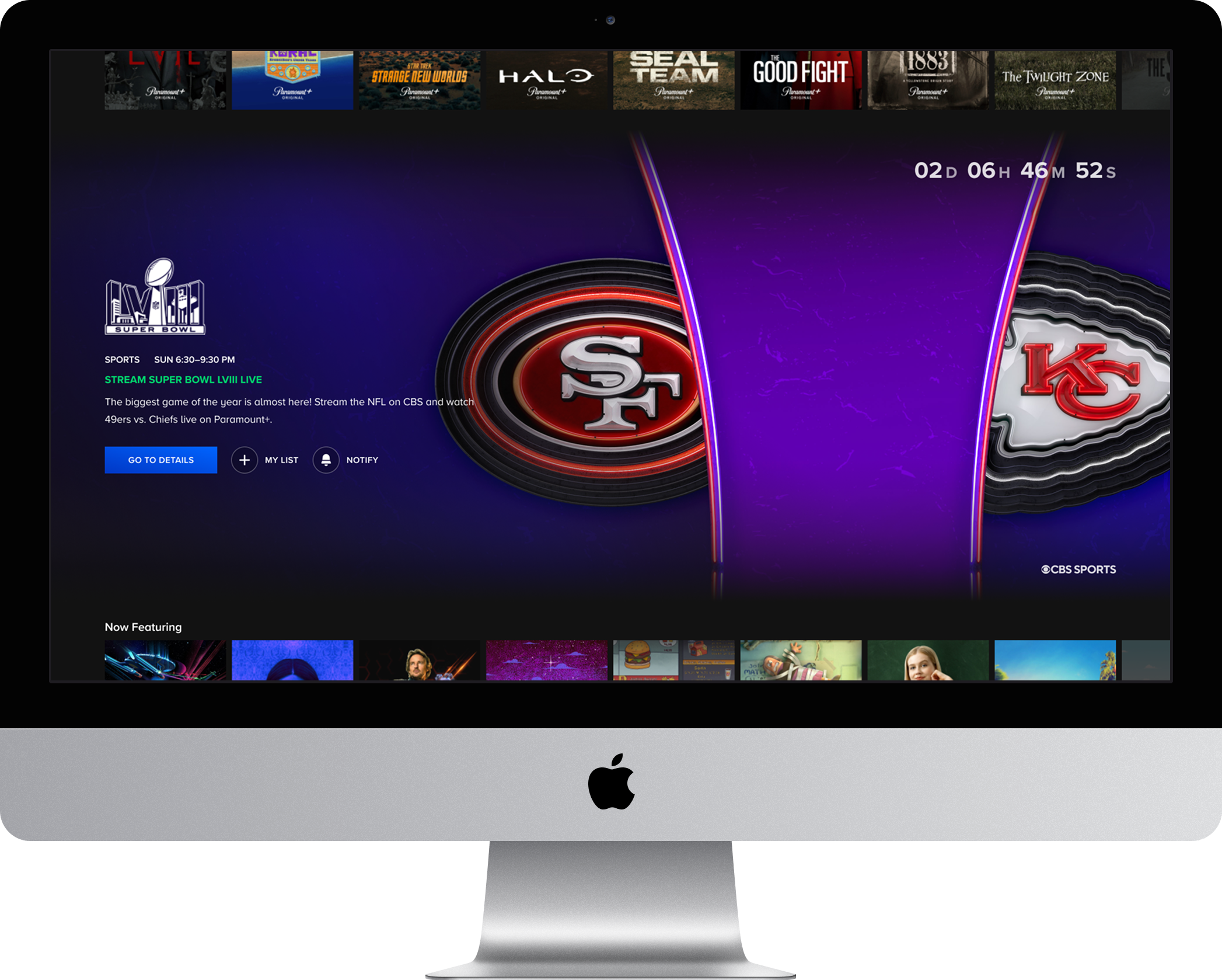
- A custom countdown experience was added for upcoming live events as a deliberate UX investment. Time-sensitive content represents the highest-stakes promotional use case, and a visible countdown creates a behavioral driver that standard content promotion patterns don't offer.
- MVP CTA labeling was intentionally genericized to "Go To Details" to maintain delivery scope and avoid content-type-specific logic, a documented tradeoff with a clear path to contextual CTA strings in a follow-on phase.
Prototypes
Interaction layer
What's Next
Spotlight as a flexible surface
- Expand content type coverage across shows, movies, and Hubs to unlock the unit as a fully general-purpose promotional surface, removing the live-event-forward constraint of the MVP and enabling use by any content marketing initiative.
- Introduce multi-item carousel support to evolve the unit from a single-spotlight moment into a flexible surface that can serve both as an editorial container for curated content groupings and as a personalized discovery space, laying the infrastructure groundwork for future phases.
- Address the secondary CTA gap in the multi-item TV treatment by testing layout approaches that can accommodate My List and Details Page actions alongside a primary playback button, a challenge previously deferred due to friction with TV's fixed selector interaction model.

.png)